When I started at AFSC four decades ago—in 1981—the technology we had to master was the mimeograph machine. For those unfamiliar with the term, a mimeograph was a primitive printing press in which ink was pressed through a stencil onto paper. A basic stencil could be cut by typing on it (look up “typewriter” if you don’t know what that is, either.). That was good enough for making multiple copies minutes of meetings or announcements that didn’t need to be pretty, but you couldn’t make bold headlines, fix typos, or include images.
For more advanced projects, you could take any graphic and run it through an “electro stencil,” which would convert the image to a stencil that could be used in the mimeograph machine. That meant you could use line drawings and make headlines out of dry transfer type, which you could buy at art supply stores and rub it on using a ball point pen. You could also get a photo screened to what were called “half tones,” or what we would now call “grayscale.”
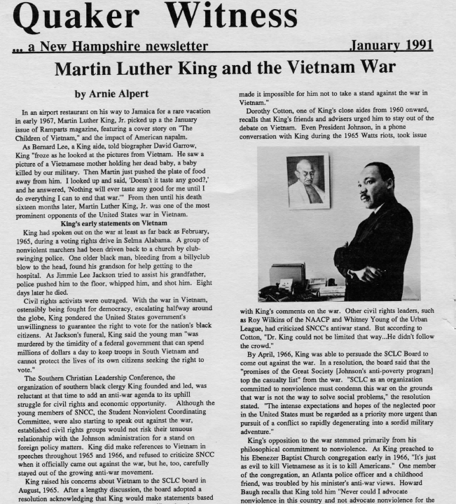
The AFSC office in Concord had an IBM Model D typewriter and a Gestetner brand mimeograph machine, but for electro stencils we had to scrounge. Fortunately, the NH People’s Alliance, which had an office two blocks from ours, had one, and we were able to use it for our newsletter, “Quaker Witness,” which I was expected to publish and mail every month.
The electro-stencil made it possible to use cartoons in our newsletter, and there were lots of cartoons to choose from in those early days of the Reagan administration, at least if we ignored copyright laws. But how to choose which ones? It was in making such editorial decisions that I encountered AFSC’s communication policies.
Like any policy, it felt bureaucratic and arbitrary. But its principles were clear. Images used in AFSC publications, it said, should be ones that uphold human dignity. That meant that cartoons, which often depend on stereotypes, were generally ruled out. “Cartoons represent a striking medium that must be used with care,” says the current version of the AFSC’s Communication Policy. “They often employ stereotypes or exaggerated portrayal of persons. These qualities can conflict with AFSC's intention to respect the dignity of all persons.” No paunchy generals or fat CEOs in top hats would find their ways into AFSC newsletters.
Photography wasn’t so much of an issue for mimeographed newsletters, but the guidelines there were similar. From the current version of the communications policy (middle of page 7 in an 8-page document adopted by the board in 1989 and amended in 1995), we read that “AFSC practice is to use photos of people that portray them in a positive light, never as pathetic victims. AFSC also seeks to be sensitive to photos that might reinforce racial or sexual stereotypes or paternalistic relationships.” So, no photos of children with distended bellies for us, but instead, photos showing people who are actively working for change.
But after awhile, after I had internalized the policy as it was applied to my mimeographed newsletters, I began to internalize it further. Treat everyone with dignity. Look for the strengths they bring to the process of change. Avoid stereotypes. Look for that which is sacred in everyone. These are great principles for organizing and for life.